How to Write a Blog Post About How to Monetize a Blog
This page contains spoilers for the How to Monetize a Blog post. You might want to check that out first if that bothers you. If you’ve already seen it, or you didn’t but you don’t care, or if you prefer to experience stuff backwards, proceed!
Either way I’m going to put a bunch of empty space right here just in case.
Prologue
I spent three months working on that page. It initially started with an amusing idea I had for a seemingly innocuous article that would gradually become become overrun by obnoxious advertisements.
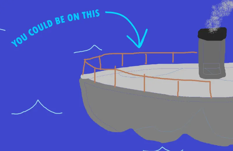
Early on I was experimenting with Midjourney to come up with some of the ad content. One of the attempts at generating a free cruise poster had severely garbled text — “you could this become” — which is where the idea pivoted from just rampant advertisements to instead devolving into existential madness. I also recently finished reading House of Leaves by Mark Z. Danielewski — any similarities drawn between that and the post are not a coincidence!
I got to toy around with a lot of weird things when making this and had planned to follow up with a brief overview of how those weird things work, so here it is.
Quick side trivia before jumping into it:
- The revenue counter is not real
- The push notifications dialog does not actually do anything if you click “yes”
- Cube Burger is not a real business (at time of writing)
- I’m pretty sure I’m mentally stable
Alright, onward!
The font
This is a copy of Colophon Foundry’s DM Sans font that I modified with FontLab 8. I added two variable axes that stretch the glyphs horizontally and vertically.
I animated the vertical axis slowly based on the scrollbar position around the “lorem ipsum” segment of the page. It remains at 0% until the text first enters the viewport from the bottom, and climbs up to 100% when the end of the text comes into view. There’s a ~15 second transition time for that hey-Siri-directions-to-the-nearest-optometrist-and-or-neurologist-please feel.
I only used the horizonal axis a few times to sprinkle some awkwardness around the page, like with the word “become.”
Lorem ipsum
font-variation-settings:
  'reac' 10,
  'lats' 50;
The spiral
I split a bunch of text into words and inserted each one into the DOM as a separate element with position: absolute to stack them all on top of eachother in the middle of the containing box. Then I applied the following transforms on each word:
rotatethe word based on its index in the source text (e.g.0degfor the first, then35degfor the second,70deg, …)translateYto move the words away from the center. Since they were rotated first, they’ll slide along their rotated Y axistranslateZto push them deeper into 3D space with a value multiplied by the word index (0px,-5px,-10px, …)
Finally I used transform: rotate(...) translateZ(...) on the parent element to spin into the whole thing.
This would look better if it were applied for each character rather than each word, but that’s incredibly difficult to pull off using this same technique without incurring an astronomical performance impact.
More controls
Diagonal text
This might not seem that fancy, but it’s one of my favorite ones: text that flows at an unconventional angle, but wraps within an upright rectangle. The heavy lifter here is the shape-outside CSS property. I threw that on some floating boxes surrounding the text to make angular shapes, then rotated the whole containing box.
Dragging the slider next to the demo will scrub through an animation that shows how it works. There’s also an (old) example of this on CodePen.
Squiggly text
The transform: translateY(...) animation from -1 to +1 on each of the characters with a negative animation-delay multiplied by the character index.
I put this one on CodePen:
Warped text
This is just an SVG filter applied to a text element via the CSS filter property. Here’s the filter pipeline in order:
feTurbulenceto generate noisefeDisplacementMapto warp the source text using the noise as a mapfeGaussianBlurto, well, blur the output a bit, andfeComponentTransferto round the alpha layer
Steps 1 and 2 (turbulence + displacement) is where the real “warping” happens. Steps 3 and 4 are just there to shave off some jagged edges and polish it up a bit.
I put a much smaller demo of this on CodePen as well.
Credits
The wonky font seen in the “lorem ipsum” segment is a modified copy of DM Sans by Colophon Foundry.
All of the text was written by me with my real human hands.
I assembled most of the ads in Affinity Designer. The few pixel art things were made with Aseprite.
Materials used in fake ad images
Here’s a list of source images used for the ads, in order of appearance (I think). I’m omitting the pixel art stuff I made (the coin, Cube Burger, Nobody’s Atmosphere, Match3World, the Mustardsoft virus). Any other images not listed below were probably generated with Midjourney.


