Tutorial Lure
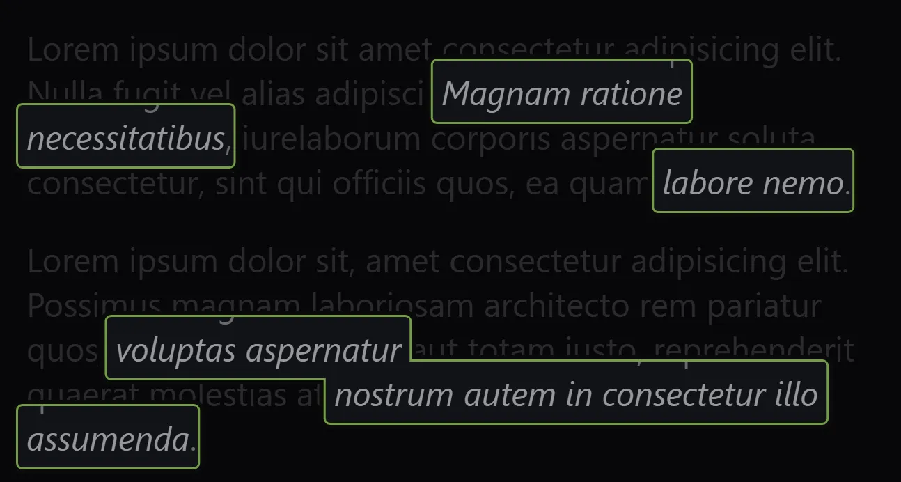
This is a solution I came up with for drawing “knockout” overlays on a page that I think is pretty clever. I used this in the past as a development tool to help visually identify localization entries on a webpage.
A common theme with tutorials embedded in web apps is drawing attention to one element by drawing a shaded curtain over everything else surrounding it. In my travels the most common methodology for achieving this is by simply positioning a transparent rectangle on top of the subject element and styling it with a box-shadow using a ridiculous spread amount just shy of infinity.
This is “good enough” in most cases but doesn’t work with multiple or inline subject elements - one box’s shadow will cover the other.
As an alternative, this One Weird Trick™ with complex shapes (SVG paths or the clip-path CSS rule) could be used to punch out more than one “hole.” It works by drawing a rectangle over the viewport to serve as the base shade overlay, then moving in the opposite direction to cut out windows.
This example uses the CSS clip-path rule with a polygon value. For more complex knockout shapes, SVG or clip-path: path(...) may be more suitable.
